 Websites by RC
Affordable Websites for Businesses
Responsive Web Design Examples

What is Responsive Web Design?
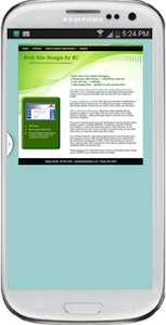
On the right is an example of a website that is not responsive. It looks outdated, doesn't adapt to display well on a mobile phone. It's hard to read the text and navigate on this website. The the user has to zoom and scroll to read the text. The menu buttons are hard to read and select.

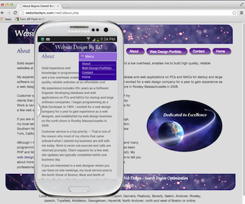
The second image is a screenshot of a responsive website. It shows the same web page on a mobile phone and on a desktop computer. The menu navigation has menu buttons for the desktop. The mobile screen has a simple drop down menu that doesn't take up a lot of space and that is easier for the user to navigate. On the mobile menu, the menu drops down (as shown) after the user has selected the menu icon.
Data rates are expensive and some mobile networks are slow. The are many techniques and methods to optimize page size and load time. When a photo is not essential, the page size and load time for the mobile users can be optimized by not loading the image. In this example, the page has been designed to load the photo on the right for a desktop computer width screen, a smaller size photo is loaded for a medium width screen like a tablet or phone viewing a website horizontally, and no photo is loaded on a mobile phone viewed vertically.
Technical implementation details — An image can be loaded as a background image in a media query for specific screen sizes, and not loaded for other screen sizes. For background images, the page size and load time only increases if the image is loaded. In contrast, when an image is in a display block (not a background image), an image is loaded when even when the it's hidden in CSS.
The image in this example is not large and the savings were minimal, but this is a good example. In practice you would not want to use all background images. Inclusion of images in the content (as opposed to background images) is beneficial for Search Engine Optimization (SEO) when images are named and tagged well.

Unlike the previous example, the product photos on this site are necessary and included for all screen sizes. This example shows how the photo placement adapts to display horizontally on a desktop computer screen, and vertically on a mobile phone. The mobile phone in this example shows the first product photo.